This a chart of the electricity usage in my home. I noted down all the data manually for input into pachube so I can use the widgets and applications to produce and collect bar charts, graphs and other data visualisation tools.
This same data is also going to be used within a group where we will need to conceptualise a method in which to visualise multiple data sources.
In a group we were set the task of combining all our gathered data from home electronical use and creating a concept for visualising all the overlaying data in a way that can be presented statically on the wall.
Using different coloured string we created a 24 hour clock with 24 pins, each an hour of time stating at midnight and running round to midnight again.
The chart allows us to see the differnet usage patterns and habits of each member of the group, for instance I use my laptop charger for 3 hours at 5pm to 8pm where as other group members were less efficient and left there’s on all night from 10pm til 9am the next morning.
The final concept presented on the wall in the studio. The piece as a whole works as a sort of overlapping, pie chart. I’ll try to replicated the design electronically in Illustrator.
Data Gathering
& Display
As well as the design we produce as a group and presented on the wall as seen previously, I also conceptualised and developed my own method of displaying the data. Using a Grid like system to display the power in watts along the bottom and the hours the appliance was used in hours on the vertical axis. The design isn't simple to interpret upon a simple glance although it gives another insight into how appliances were used over a 24 hour period.
The grey box, for instance, shows that the LCD Television was used for a period of 7.5 hours and uses 110 watts of power. The chart could be used to analyse BOTH the power and time used or just each stat individually.
Although it may appear confusing at first the numbers are supposed to be doubled essentially, so where the TV have a box inbetween the two "1" markers on the hour scale it was actually on for 2 hours. The chart could be simplified by changing this to mean the exact number.

Data Display and Information Graphics (infographics) can take on many forms and styles besides the simple, abstract layouts I've experimented with. Infographics allow designers, scientists, mathematicians, statisticians etc. develop and communicate concepts using simple symbols to process information.
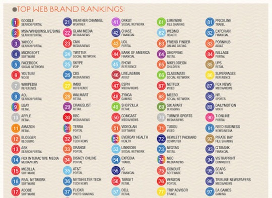
The infographic is a simple list of top 97 web based brands. The main design trait here is the use of the companies logo primary colour being used to distinguish them alongside their name and ranking. Because of this, besides showing the reader the ranking of all the companies, they can also see there's a heavy use of specific colours, especially blue in the top ranking brands. Whether the designer intended for that is debatable but it's still another representation of information through a simple symbol and colour change.
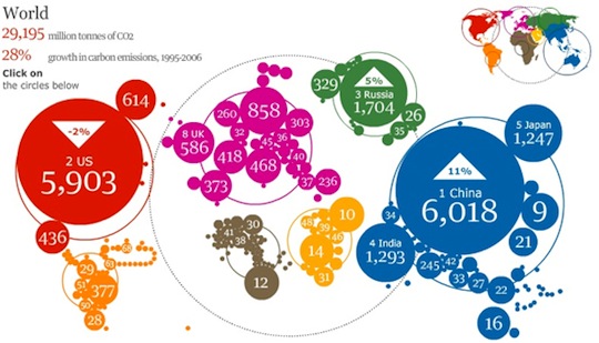
The above infographic is actually interactive, although works also as a static representation of data. Showing the world's Co2 output in tonnes the designer has used colour as a tool to distinguish the continents as well as the fact the circles are placed roughly in the same position as on a world map. The size of each circle represents the Co2 output in tonnes, which can be simply interpreted by glancing at the obvious ones such as China and the US.
I like the simple nature of this design and it's extremely simple to decipher immediately. It seems to be a common trait for designer to use world maps somehow when creating infographics based on data that includes the whole world.
This infographic (click to enlarge) comes from the book "Information is Beautiful" by David McCandless, which features pages and pages of data visualisation in unique and simplified ways. This infographic example from the book displays the interpretation of colour within different culture. For instance in the A section which represents American/Western culture, 1 displays the colour said culture links to "Anger", 2 for "Art/Creativity" and so on.
A confusing-at-first piece, but when you wrap your head around the design it becomes an extremely interesting concept.
This is another infographic from "Information is Beautiful" that breaks down facts about the size of the African continent. At the heart of the infographic is the standout image which immediately shows the reader the sheer size of Africa through filling the land area with numerous other countries. Alongside the main image are various textually presented facts to further back up the main point.
A selection of infographic and data visualisation blogs and websites I visited during my research on the subject. Some offer explanations of complex designer whilst other present new and unique ways of approaching and handling data visualisation.
It's worth considering how these infographics relate to the data visualation provided by Pachube and the developer community apps.
